
Welcome Friends (Editor Edition)
One design, three interpretations
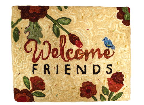
Welcome Friends; 24 1⁄2"x 20", #4-, 6-, and 8-cut dyed and recycled wool on linen. Designed and hooked by Ellen Banker, Williamsburg, Virginia, 2016.
This rug illustrates a contrasting relationship of type. The word “Welcome” was drawn based on a script typeface called Heart and Soul. The word “Friends” was set in Futura Medium. The result: type contrast. The contrast carried through into the color choices as well.
Signs are so widespread that we hardly notice them. And, according to the International Sign Association in Alexandria, Virginia, we don’t really consider the effect signs have on us which, they claim, is precisely why signs are so effective. Ah, an effective sign sounds like a design element worthy of a hooked rug.
To dive a little deeper into the subject: Signs generally—but not always—contain words. And signs are generally—but not always—created for a specific purpose. Think about information (a facility’s name, a map, or instructions); persuasion (promotional signs for brands or products or a sale); identification (room names or numbers); and safety (warning signs, traffic signs, exit signs).
For a softer approach, let’s look at another utilitarian use for signs: hospitality. Utilitarian, but gracious and sweet, a welcome sign can offer a warm greeting to your guests and find an appropriately welcoming spot on your entryway wall or floor.
This exclusive RHM Welcome Friends pattern was created to welcome, of course, but also to introduce several methods of hooking type in rugs. This pattern includes two different typefaces and methods of incorporating lettering into your rug designs.
The Typefaces
The rugs shown here illustrate a contrasting relationship of type. The word “Welcome” was drawn based on a recently designed script typeface called Heart and Soul. The word “Friends” was drawn based on Futura Medium, a sans serif face developed in the early twentieth century. The result is that these two very different typefaces create contrast. And contrast can really be appealing.
A note about sans-serif typefaces: It wasn’t until the German Bauhaus school of design was formed in 1919 that sans-serif typefaces (typefaces without any serifs that are found on the traditional old-style serif letterforms—“sans” is French for “without”) began to be popular. Following the Bauhaus motto of “form follows function,” typefaces were stripped down to their bare essentials, to their simplest, most functional forms. Futura is a great example of a sans-serif type, and it is my favorite typeface.
Heart and Soul, a script that was designed by contemporary graphic designer Nicky Laatz, is a wonderful starting point for elegant words. Designers have developed script typefaces in almost every period of typography. Their common element: they emulate handwriting. Script typefaces can be elegant or funky. But you can always identify a script.
-
Welcome Friends; 24 1⁄2"x 20", #4-, 6-, and 8-cut dyed and recycled wool on linen. Designed and hooked by Ellen Banker, Williamsburg, Virginia, 2016.
This rug illustrates a contrasting relationship of type. The word “Welcome” was drawn based on a script typeface called Heart and Soul. The word “Friends” was set in Futura Medium. The result: type contrast. The contrast carried through into the color choices as well.
Methods of Hooking
With straightforward designs—like the word “Friends”—where you are going to hook one row of wool for each letter, just go ahead and hook the letters. The sample word was hooked in a #8 cut. One hint is to hook a couple of letters at a time and fill the background in around them as you go. This makes it less likely that you’ll accidentally pull out an individual loop for a letter that you just hooked while also giving the piece a bit of stability. Plus, it ensures you have at least one row of hooked wool between your letters.
Another hint is to hook the letters slightly higher than you normally hook the background. They will stand out just a little more, but it won’t be really obvious.
Now, for the script “Welcome.” The sample rug uses the “multiple cut method” of hooking this word. This technique works really well with type that is both thick and thin. I use this kind of type and this method in many of my rugs. It can be done with a single color of wool, values of one color, or with completely different colors of wool. My preferred cuts are #4, #6, and #8. So, when I am beginning to hook words, I make sure I’ve cut wool in all these sizes. Then it’s easy to pick the cut that feels right for any part of a letterform. In some rugs, where a #8 cut would do the trick, I sometimes use two noodles of #4-cut wool that might have a bit of a different shading or a mottled effect that I just could not get with one strip of wool. Using multiple cuts of wool is a versatile method and can be rather forgiving as well.

The Pattern and The Rugs
The pattern provided can be output at any size in its entirety or you may choose just to take elements of it to add to your own pieces. (Design attribution is appreciated.) If you have the pattern output at 350%, your pattern will end up being 24 1⁄2" x 20". Trace it on the backing material using a lightbox or other light source or with the red-dot method, if you prefer.
Both of our example rugs are 24 ½”x 20” and are based on the pattern provided here. A note about the images (other than the words) in our pattern: These are snippets of Baltimore Album Quilt blocks! The pattern could be enhanced by additional snippets of the quilt blocks or hooked exactly as is. Both rugs have been hooked with the reds and greens so prevalent in traditional Baltimore Album Quilts. But the rugs have certainly taken on unique elements from each maker.

Deb’s Rug
I love the tweeds and subtle variations in Deb’s background. This is very inviting and gives a great combination of contemporary and vintage feelings. All of the wool came from Deb’s stash. (What a great stash of choices!) Deb did the rug because she loved the design and wanted to do a “word” rug with different fonts/typefaces. “It is a sweet, appealing pattern that can be interpreted in lots of ways,” Deb says. “I had not done a welcome rug before and this one caught my eye.”
-
Welcome Friends; 24 1⁄2"x 20", #4-, 6-, and 8-cut dyed and as-is wool on linen. Designed by Ellen Banker and hooked by Debra Smith, Landisburg, Pennsylvania 2016.
This rug illustrates a mellow approach with color. The type blends seamlessly with the tweed background but stands out because of the use of the vibrant red and green colors. Note the emphasis on both words that Deb achieves by using a very dark value to outline her words for emphasis, but only on some strokes.

Ellen’s Rug
Contrast is an element of most of my rugs (for better or worse). I think that my habit of introducing extreme contrast in a rug design is a result of working in the graphic design business for so many years. Contrast is essential in print. The background of this rug was hooked with three values of a beige/linen color with lots of movement and some tiny surprises throughout. Look closely at the background and you will see tiny snippets of red, green, or gold. It’s a fun technique I picked up from Jule Marie Smith at a Green Mountain class many years ago.
Have fun with hooking this project! We would love to see how you interpret this pattern and welcome it into your work.
-
Welcome Friends, 24 1⁄2" x 20", #4-, 6-, and 8-cut wool on linen. Adapted from RHM's Welcome Friends pattern designed by Ellen Banker. Hooked by Laurie Olson, New Orleans, Louisiana, 2016.
Laurie began her rug in a class at Green Mountain Rug School in the summer of 2016. She hooked the words in class and then designed the images of ferns and that adorable firefly as she developed her piece. Laurie's color choices are complimentary and reflect her New Orleans roots. Beautiful!

Ellen Banker is a graphic designer, rug hooker known for her whimsical designs, and author who is a frequent contributor to Rug Hooking magazine.
For more information about typefaces, fonts, hooking methods, and a collection of inspirational rugs with words, check out Rug Hooking magazine’s new book Hooked on Words, which will be released May 2018.
Read NextChristmas Cardinal


