Archangel Michael
Color planning a medieval tapestry

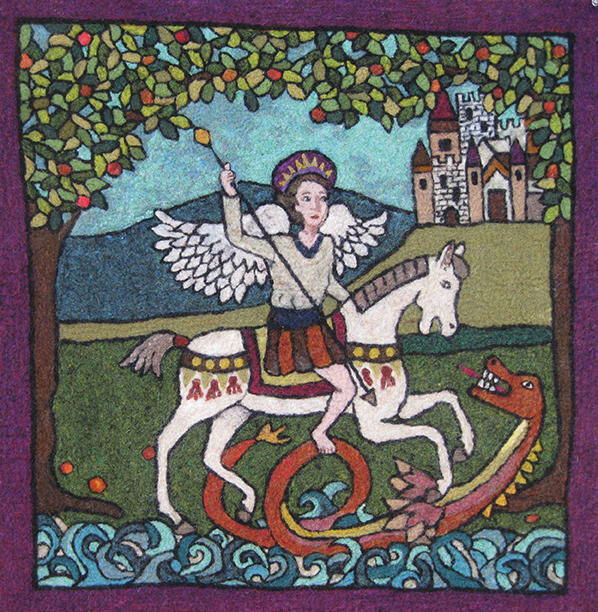
Medieval Angel, 28" x 28", felted wool. Designed and created by Neysa Russo, Bradford, Vermont, 2016.
Good vs. evil: It is a traditional religious theme that has been used throughout history to create dramatic tension, from ancient art and literature to modern-day movies and novels. This medieval-inspired tapestry of the Archangel Michael has all the elements necessary in a great story: action, animals and people in motion, and a bold color palette.
Color planning is a very personal task. Individual tastes are diverse and there are no right or wrong choices. There are ways to make your work more eye-catching, placing colors to create balance and provide the momentum that moves the entire scene into action.
I used traditional landscape colors for this tapestry. However, to achieve a medieval flair, I chose darker shades of each color. A shade is a color that has had black added to it for the purpose of subduing it. These darkened colors reflect the medieval setting. While preparing your color choices in advance is an efficient way to work, it is equally important to stay flexible, as new ideas may evolve during the process. Remember that the position of colors can maximize a dramatic effect.


